VIDEO: How to Give a Presentation
A successful sales presentation is one that is remembered and leads to action.
In order for a message to get into long-term memory it has to be processed by working memory first. In reality, working memory is small and relatively easy to overload. If you present too much information at once (or present information that is difficult to process), working memory will be overloaded and your message will not be remembered. Your sales presentation, your time and effort will have all been wasted.
This short video explains how to give a presentation that avoids all that waste:
Good sales presentation design reduces the load on working memory, increasing the chance of your central message getting through to long-term memory.
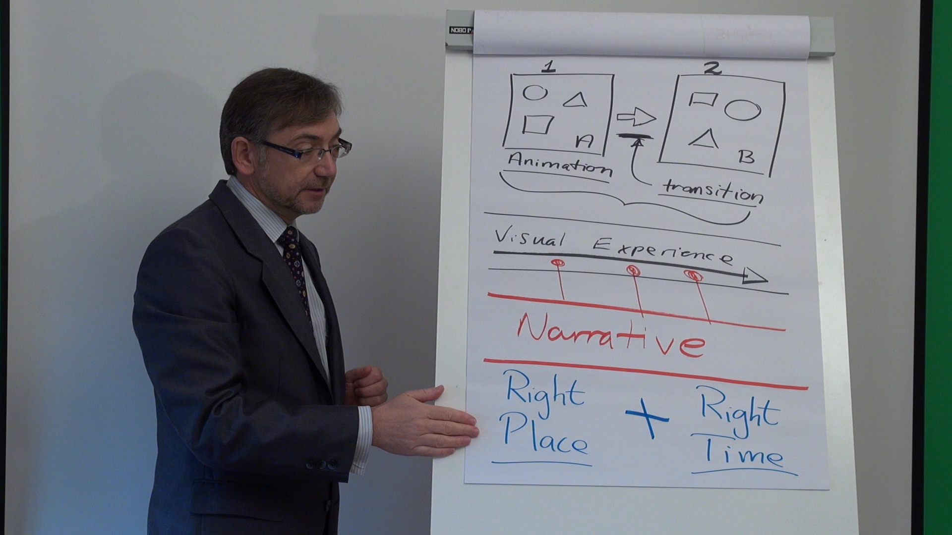
Considering two PowerPoint slides, animations are what appear on the slides themselves. Animations are used to make objects or text appear and disappear – and they can also be used to rotate objects and make them move around slides. Transitions on the other hand, are what get you from one slide to the next. The key difference being what happens between slides versus what happens on a slide.
Used together, animations and transitions can create a complete visual experience from end to end. The audience should not be able to distinguish between slide 1, slide 2, slide 3, slide 4, slide 57, 59, 63 etc… Your sales presentation should be a seamless, single stream of graphics, supported by what you say. That is, the narrative.
Key to the success of sales presentations and sales presentation design is the ability (of the presenter) to create and deliver an integrated performance. A continual visual experience - using animation and transition - that is supported by a narrative, delivered by a speaker standing in the right place at the right time. That’s what gets a message into an audience’s long term memory.

